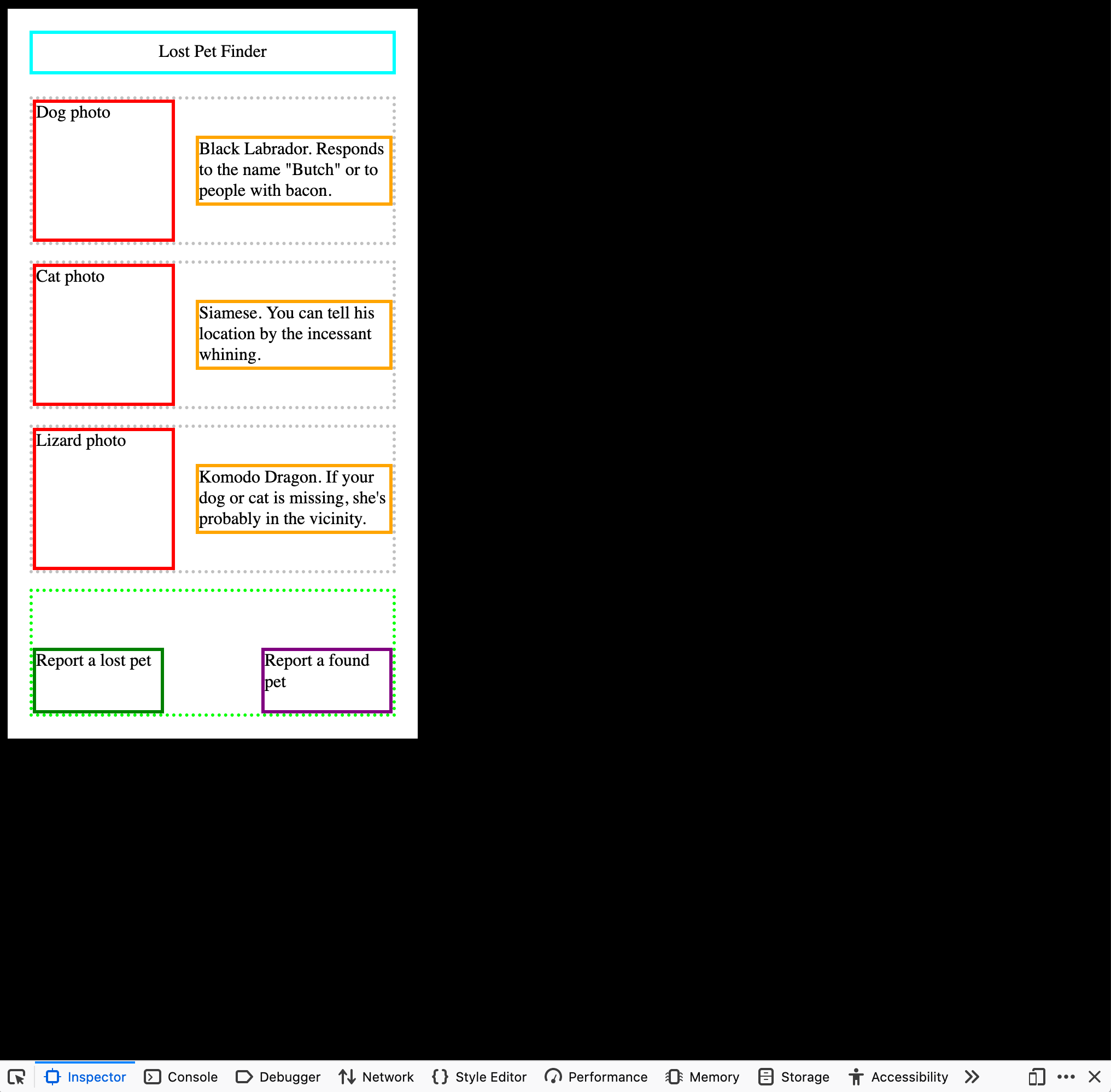
 When you're designing a website to look good on mobile, it's not always easy to load your site on an actual phone or tablet. So it's tempting just to add a container (div) with the dimensions of a mobile device.When you're designing a website to look good on mobile, it's not always easy to load your site on an actual phone or tablet. So it's tempting just to add a container (div) with the dimensions of a mobile device.
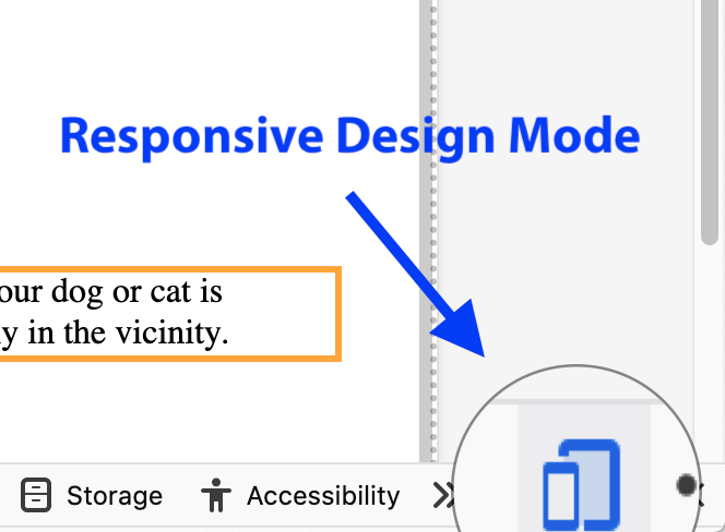 However, the best way to check mobile design is using your browser's "Responsive Design Mode." On Firefox you can toggle this with the key combination Command-Option-m or by clicking the phone icon at the lower right of your inspector.
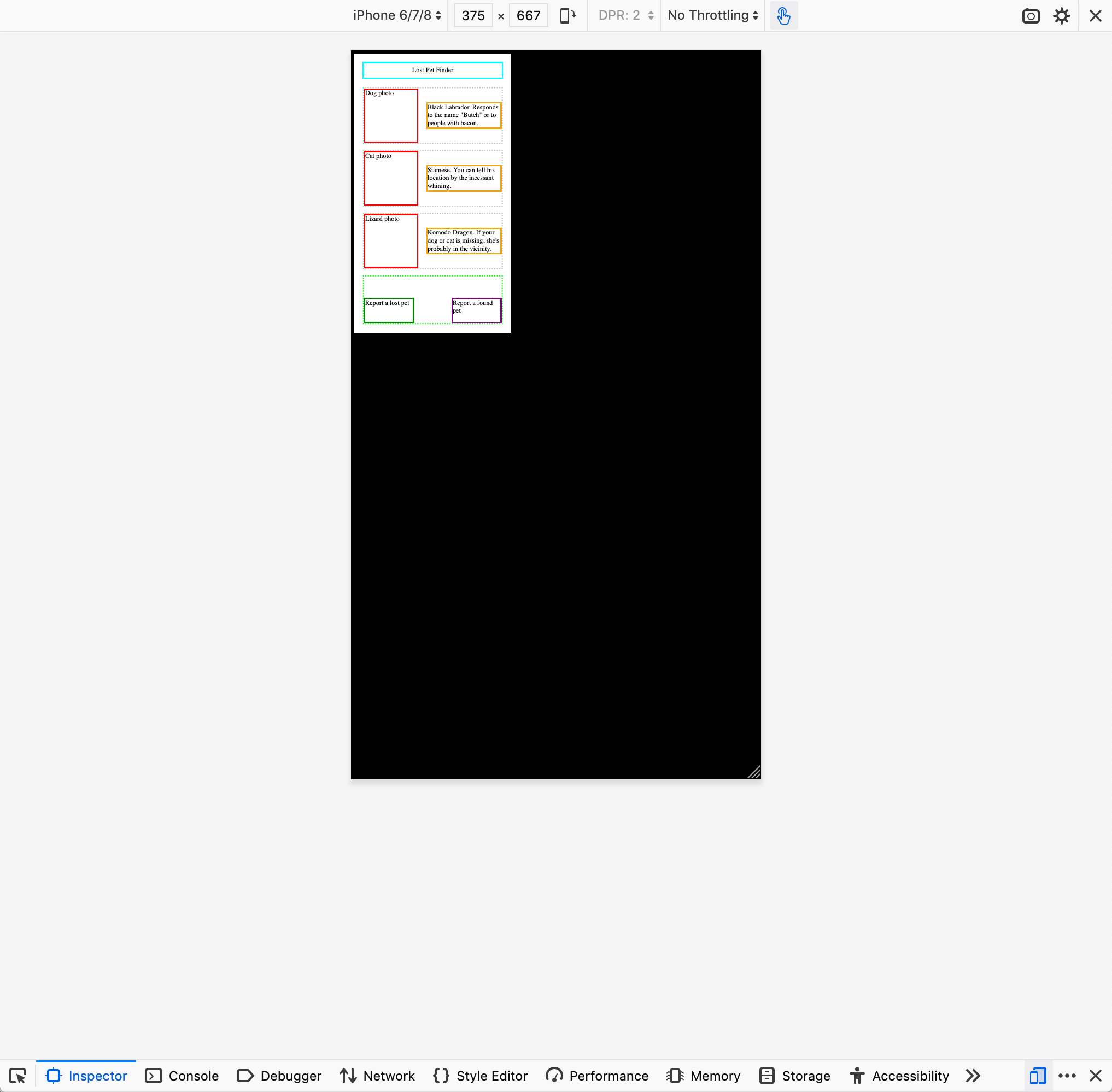 Unfortunately, this view often shows that fonts and images that work fine on a desktop monitor are too small to be seen on a mobile device.
		/*__________ Normal styles for a desktop browser. __________*/
		body {
			font-size: 1em:
		}
		.photo {
			width: 300px:
			height: 300px:
		}
		.description {
			width: 300px:
		}
/*__________ Style overrides for a mobile browser. __________*/
		@media only screen and (max-device-width: 375px) {
			body {
				font-size: 1.3em ;
			}
			.photo {
				width: 130px ;
				height: 130px ;
			}
			.description {
				width: 180px ;
			}
		}
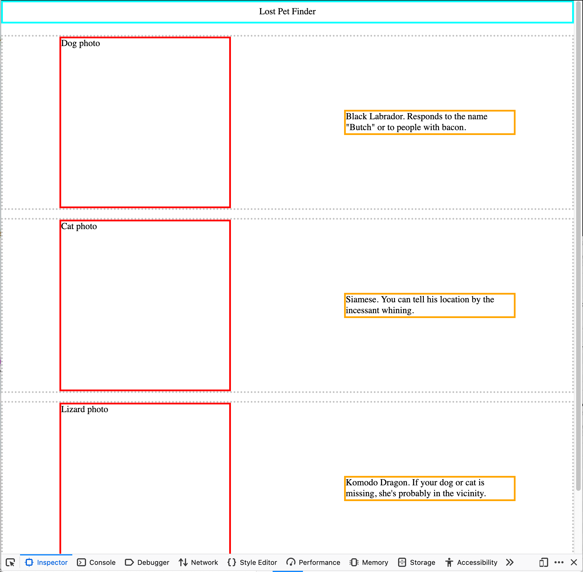 Now the sizes of images and text are appropriate for desktop.
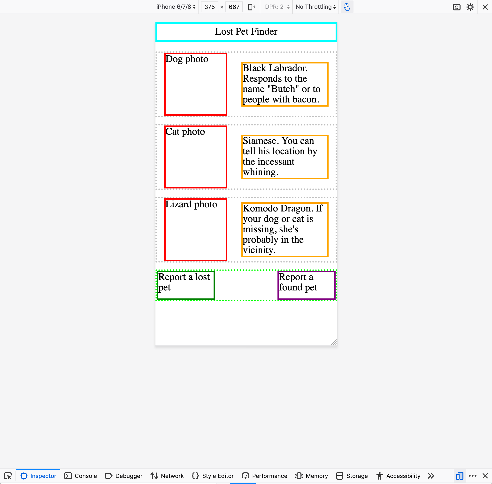 On mobile, the images shrink to fit but the fonts grow enough to be readable.